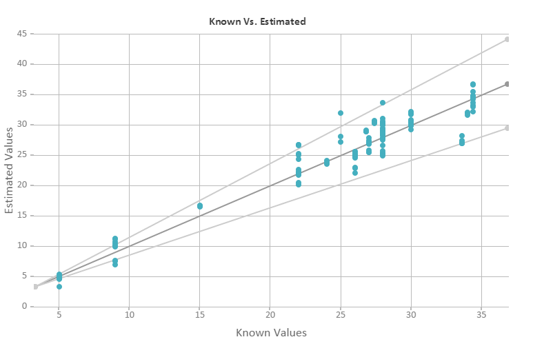
When you assess the performance of an estimation model you’ll want to use the Known vs. Estimated scatter plot.
In an ideal situation your model estimated value is the same as the known value. But the reality is that noise and other effects can influence your results and this does not occur. To analyze the success or failure of your potential model, SCiO Lab enables you to view the results as a scatter plot.
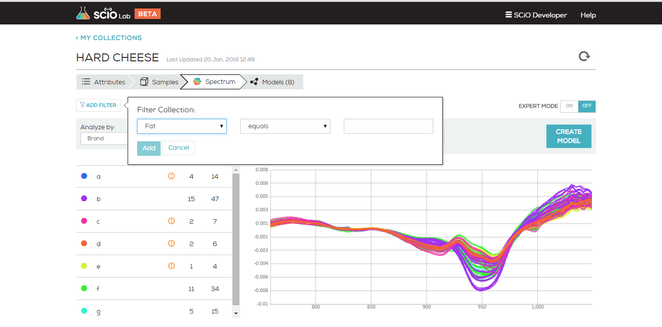
To create a scatter plot:
- Navigate to the Spectrum tab of a Data Collection
- Select an attribute to filter the model building from using the Analyze by filter on the left side of the screen.
- Apply one of the pre-designed preprocessing methods or create your own using the expert mode.
- Click Create Model.
- Your model’s performance is displayed as a Known vs. Estimated Scatter Plot, and provides performance metrics and if needed, suggestions for improvement. If you model does not contain enough samples, a warning will appear above your Scatter Plot, alerting you to scan more before trying to build.
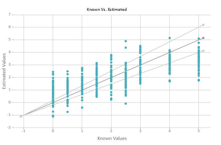
Bad scatter plot
On each scatter plot, the horizontal axis shows the known values and the vertical axis displays the estimated values. Each point on the scatter plot represents a data point (one scan). In the scatter plot, the central line represents the optimal model. The upper and lower limit lines represent the 20% error margin.


