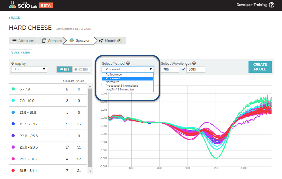
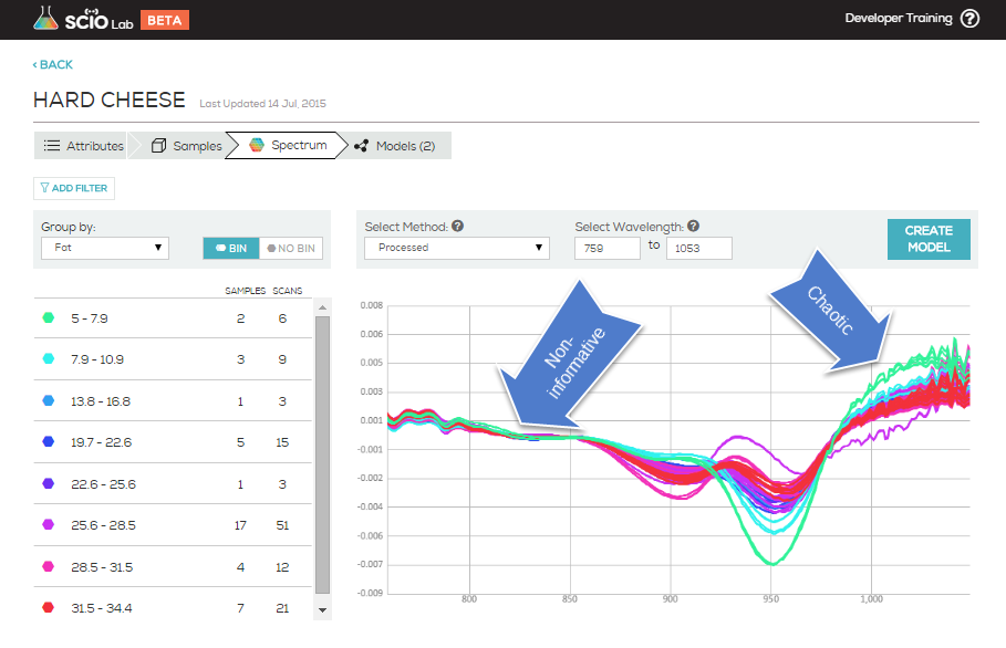
When viewing the scans of a data collection, the preprocessing method options allow you to view your data collection spectrum with different algorithms applied. These can help you identify outliers, inaccurate scans and reveal possible relationships in your data.
Within the graphs SCiO Lab Mobile presents:
X is the wavelength represented in nm (nanometers).
Y is dependent on the selected preprocessing method you choose.
When:
- Reflectance is selected: Raw reflectance spectrum.
- Processed (only): Assumes Beer-Lambert model is valid, and transforms the measured signal to be linear with concentration by doing a log transform and adjusting the result for noise and deviations from the model. You can learn more about Beer-Lambert here
- Normalized (only): Performs normalization of the signal. This is meant to compensate for changing measurement conditions (e.g. varied scanning distances) that typically occur from sample to sample. Y axis still means reflectance but in normalized units instead of raw reflectance.
- Both Processed and Normalized: First assumes Beer-Lambert model (Processed) and then normalizes the results to compensate for differences in the optical path between samples. This is useful, for example, when there is variation in the thickness of the samples.
- Both (log)R))” and Normalized: Similar to Processed and Normalized, uses a more aggressive form of Processed. Adds more noise, but in some cases may be the only way to create a good model.
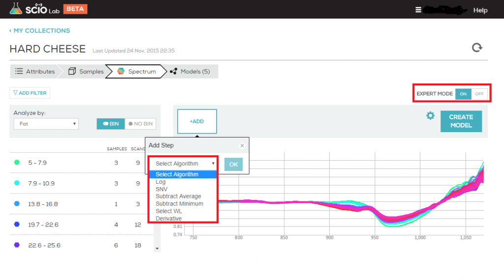
When Expert Mode is activated you can define your own preprocessing methods
When:
- Log is selected – takes the natural logarithm of each value in the spectrum.
- SNV – calculates and subtracts the average of each spectrum and divides it by the standard deviation thus giving the sample a unit standard deviation (s = 1).
- Subtract Average – means subtracting the average-over-wavelength from each point of the spectrum to eliminate remaining trends after log+derivative, or to eliminate the gain (lambda independent gain) after log. So for example, if the spectrum fluctuates between 3 and 1, after “subtract average” you’ll get the same spectrum, only this time it will fluctuate between +1 and -1.
- Subtract Minimum – means subtracting the minimal value (same value for all the points) from each point in the spectrum, so now, the spectrum “touches” the point zero at its minimum. Now, if the original spectrum fluctuates between 3 and 1, the spectrum after “subtract minimum” will fluctuate between 0 and 2. This is useful when you want to have the spectra on the same baseline without having negative values.
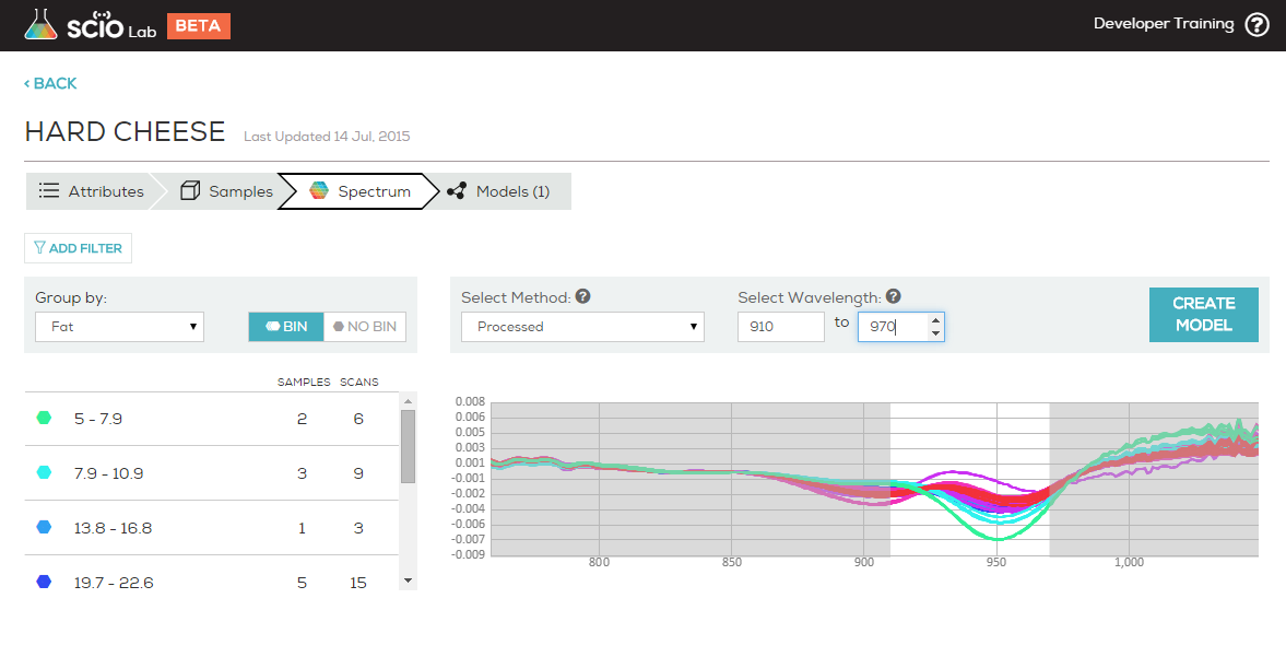
- Select WL – choose the wavelength to use in the next step of analysis.
- Derivative – takes the 1st or 2nd derivative of the spectra. Derivatives of spectra are useful for two reasons: 1. First, and second derivatives may swing with greater amplitude than the primary spectra. For example, a spectrum suddenly changes from a positive slope to a negative slope, such as at the peak of a narrow feature. The more distinguishable derivatives are especially useful for separating out peaks of overlapping bands. 2. Derivative spectra can be a good noise filter since changes in baseline have negligible effect on derivatives.
Typically, different models and types of samples will require different preprocessing methods. You should choose both the preprocessing method to match your experimental setup and optimize the performance of your model. If you planned and gathered your data correctly, these efforts will coincide.


